Hey everyone, welcome back to my blog! Today I wanted to give you ALL of my knowledge and hopefully allow you the proper tools to get your hand lettering journey started!
Alright, let’s start off really basic–What is Hand Lettering?
Hand lettering is the art of drawing letters, rather than simply writing them. Hand lettering also refers to drawing them by hand, as opposed to creating these letters digitally. I have worked with both art forms–physical and digital–and I prefer physical drawing, but that’s totally just personal preference.
Adding onto the idea that hand lettering is the drawing of letters, it is also the art of creating different fonts, styles, color theory, and layout design to create beautiful pieces. If some of these ideas sound foreign to you, don’t worry! I’m going to discuss them more in depth later in this post. However, before we get into layout, color theory, fonts, and styles we must first make sure you are properly equipped with the right materials to begin.
1. Materials
I’m going to be completely transparent with your right now and let you know that you DON’T need any fancy pens to hand letter or brush letter! You can simply start with pencils or ball point pens. Seriously, it’s as simple as that. I will be honest, however, and let you know that I started with brush pens, but I completely destroyed them and wish I would’ve started simpler. So run to your nearest kitchen drawer and grab that no. 2 pencil, and a piece of white printer paper. Once you have had some substantial practice and understand basic letter shapes, I would advance to brush pens! This advance also comes with a different paper. I would recommend watercolor paper, as it creates the most beautiful blends, but it is also very harsh on pens. Lots of hand lettering artists recommend marker paper, but I have never actually tried it, so I would feel silly making that recommendation.
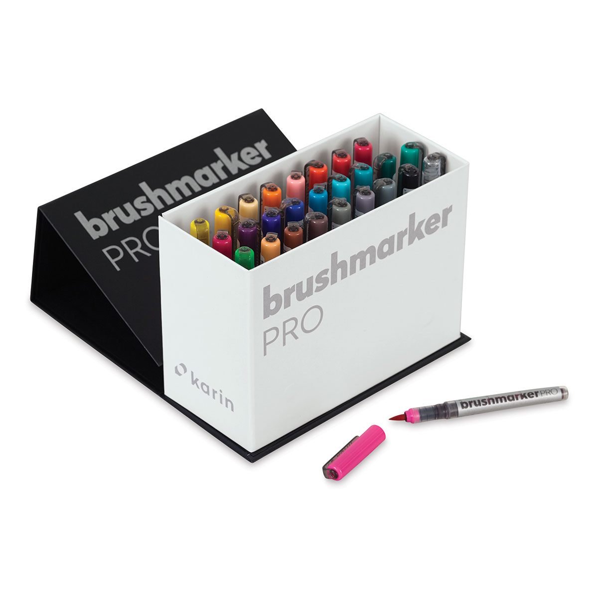
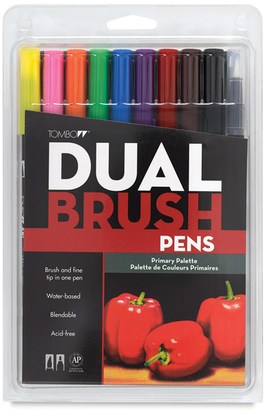
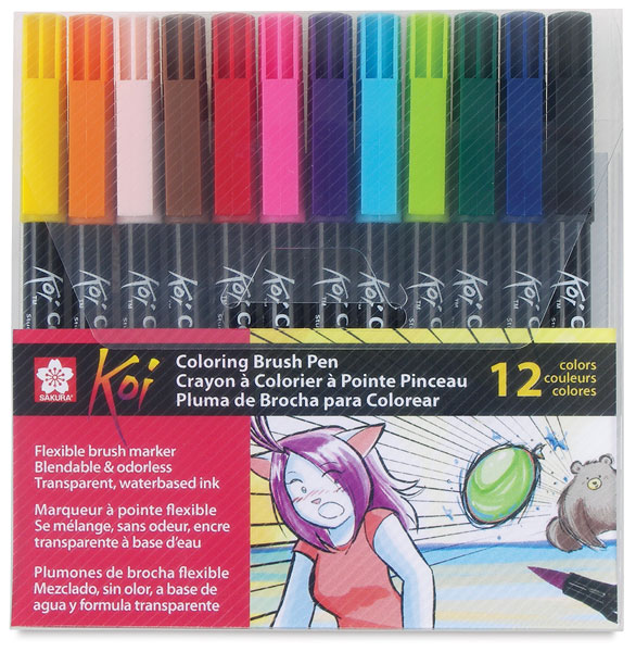
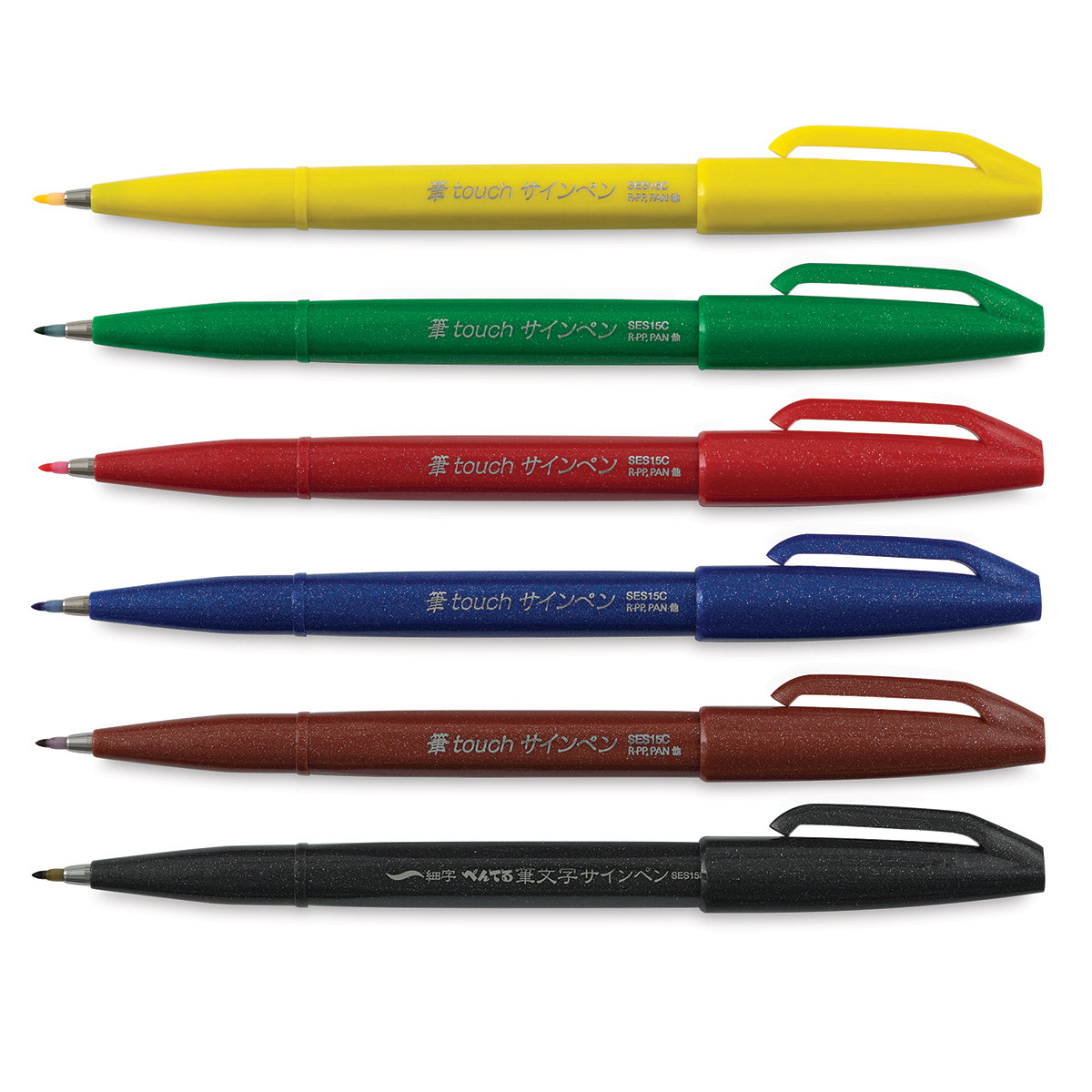
Some of my favorite brush pens include: Karin markers, Tombow Dual Brush Pens, Sakura Koi Coloring Brush Pens, Ecoline Brush Pens, and Pentel Arts Brush Tip Sign Pens.
Here are pictures and links to all of those!

2. Basic Fonts to Learn
Honestly, I feel like I don’t have a whole lot of knowledge when it comes to different fonts, besides knowing which ones I like and which ones I don’t. I stick to two basic font categories in my work: bold, san serif fonts and calligraphy fonts. Within these two categories, you can totally change the fonts up!
Here is an example of writing the same word in a calligraphy style font, but as you can tell they’re all a little different.

Just like with the calligraphy fonts, I totally change up my bold font. I can make it taller, skinnier, fatter, or wider. If you really examine some of the quotes I’ve lettered, you can totally see there is not much difference between the fonts.
By keeping it simple and allowing yourself just a few fonts to slightly change, I have found that it helps you to find your style and really keep consistency in your work.
3. Basic Calligraphy Strokes
When learning calligraphy, it’s super easy to break down into individual brush strokes. There are three basic brush strokes to practice and perfect: the upstroke, downstroke, and the loop. Here is a photo showcasing the three different strokes.

When learning these strokes, there are only two basic rules. Upstrokes are thin, and downstrokes are thick. This sounds super simple, and honestly is, but I remember how challenging it was when I first started. It was tricky to transition between the thick and thin, but that’s why I first starting with faux-ligraphy. This eliminates the hassle associated with brush pens and how difficult they are to work with, at first.
Just remember, that with time and practice this will become so easy and effortless!
4. Lettering Layout
Now that you’ve practiced some different fonts, and have your basic brush lettering down, you can start writing quotes and phrases!
Layout can, at first, be tricky. Figuring out balance in your pieces will take time, but hopefully some of these tips will help you expedite this process!
When deciding what your layout is going to look like, first ask yourself which words are the most important. These words should be visual focal-points. Whether that means a simpler, bold font or an elaborate calligraphy font, these words should hold more “value”–paper space. These words should catch your audience’s attention, and serve as the first impression of the quote.
Next, you want to decide which words don’t hold much value at all, such as “and”, “the”, or “is”. These words can easily be tucked away, or used to add details and embellishments. I often times will make a circle of color and add these words in white. This serves to add some extra dimension, while also not drawing your attention to these words.
Finally, with the remainder of your quote, decide how you want the words to lay. I often like my quotes to fill up a rectangular or square space. I will then fit the remaining words accordingly.
Here are some examples of quote layouts I love!


5. BONUS- Color Theory
My favorite part of hand lettering is the wide variety of color I have at my disposal. I often struggle deciding on what colors to use, but have some basic tips to help myself, and hopefully you, choose a good color palette!
First, monochrome palettes. I love a good palette of all blues, all greens, and all oranges. These are my three go-to monochrome palettes. However, you can use ANY color. Just make sure that they are in a relative shade range. I would also recommend using 4 different shades, minimum. This helps build contrast and add depth in your pieces.
Second, segments of the rainbow. This one is pretty self explanatory, but instead of sticking to one color, you find a segment of the rainbow! I love green-blue, and red-orange. You can also go across the whole rainbow, if you’d like! This color picking method is one of my most common, as it gives seamless transitions from color to color and the colors blend beautifully.
Finally, complimentary colors. I don’t use this color palette method quite as much, as it creates huge contrast. I usually want something a little more subtle. However, examples of this kind of palette include orange and blue, yellow and purple, or green and red. Obviously, for Christmas, I utilize this all the time! Red and green provide a great contrast, while also being staple colors for the holiday!
Alright, I’ve instilled ALMOST all of my information with you! I hope that you can now, effortlessly, start your lettering journey! Please contact me with any questions you have, and tag me if you use any of these tips! I can’t wait to be in touch and see your work!

I e always loved to write. Now I need to practice up. It’s been years. This is an awesome learning experience.
LikeLike